Exploring the <input> element and its functionalities
Come take a look at the varied functionalities of the very versatile <input> element!


Hi there :). Today, we would learn about or refresh our memories on a commonly used HTML element - The <input> element. Not to worry if you are a newbie in the developer community and have yet to use this element. In this article, I will explain the <input> element, its functionalities, how to use it, and its accompanying attributes that further customize the element's behaviour and functionalities. Buckle up, Developer! you are in for a treat :).
Prerequisites
To follow along with this article, you would need:
A basic understanding of HTML
A code editor (preferably Visual Studio Code)
The <input> element
The <input> element is a self-closing HTML element that is used within a form element, it allows users to type in data in an information field. Although it is one of many elements used to build a form - it is the most important. Due to the various ways it functions, this element can often be complex for the new developer (say goodbye to complexity after this read!). Like most elements, the <input> element has an attribute and a value that modifies what it displays or functions as. Let us take a look at how a typical <input> element is represented. The code syntax: <input type="text" name="lastname"> is further explained in the illustration below:

A typical <input> element can be used in a variety of ways, for example:
To accept text input such as name, email address, passwords etc...
To choose options from a radio button list
To select options from a dropdown list
To tick options on a checklist
To upload a file etc.
Attributes and values
Now that you have been introduced to a thing or two about the <input> element, let us learn about the different attributes, values, and their respective functions on the <input> element.
type attribute
The type attribute determines the type of data that is accepted by the <input> element. This attribute, together with its corresponding value(s), customizes the functionality of the <input> element in various ways. Simply put, the type attribute gives the <input> element its identity. Some of the well-known values for the type attribute include but are not limited to:
Text: This creates a single-line text field where the user inputs their data.
Email: Although it looks similar to the text field, it only allows users to input their email addresses.
Password: This creates a single-line information field where a user enters their password (as a security measure, the user's password inputs are obscured as black dots).
Radio: This is used to create a collection of radio buttons that allows the user to choose an option.
Checkbox/list: This creates a collection of checkboxes/lists that lets the user tick their desired option.
Date: This creates a control that allows the user to enter a date - year, month, and day.
Submit: This allows the user to submit their inputted form data to the form handler (database).
Number: This interface lets the user enter only numbers in that specific information field.
Reset: This lets the user reset the form inputs to their default value.
File: This interface allows the user to upload a file on the form.
name attribute
It specifies a name for the information field, which can be used to identify and access the input data. In Fig 1.0, we highlighted the name attribute, and its value shows us the data to be inputted in the specific information field is the user's last name, not their first name.
placeholder attribute
This attribute specifies a hint or a placeholder text (AKA dummy text) for the information field. This means it gives the user an idea of the data to enter into the information field.
required attribute
The required attribute alerts the user that the information field must be filled out with the necessary data before the form can be submitted. A red asterisk symbol or a popup reminder usually indicates a required field (varies). This attribute prevents users from submitting incomplete data to the form handler.
max attribute
This attribute is used with numeric input type (such as number). It is used to specify the maximum number of characters that can be entered into the information field.
min attribute
It does the exact opposite of what the max attribute does. This means it specifies the minimum number of characters that can be entered into the information field.
Other attributes include
disabled: This attribute specifies that the input element is disabled and cannot be edited.pattern: Specifies a regular expression that the input element's value must match to be valid.autocomplete: Specifies whether or not the browser should automatically complete the user's input.readonly: Specifies the information field can only be read and not modified by the user.title: Thetitleattribute displays a tooltip when the user hovers over the information field.
Code syntax of <input> element, attributes, and values
The code examples below represent the structure in which some of these attributes and values are written. You can alter the values to reflect the specific information you want in your form.
Code input:
<!DOCTYPE html>
<html lang="en">
<head>
<link rel="stylesheet" href="styles.css" />
<title>Input element and attributes</title>
</head>
<body>
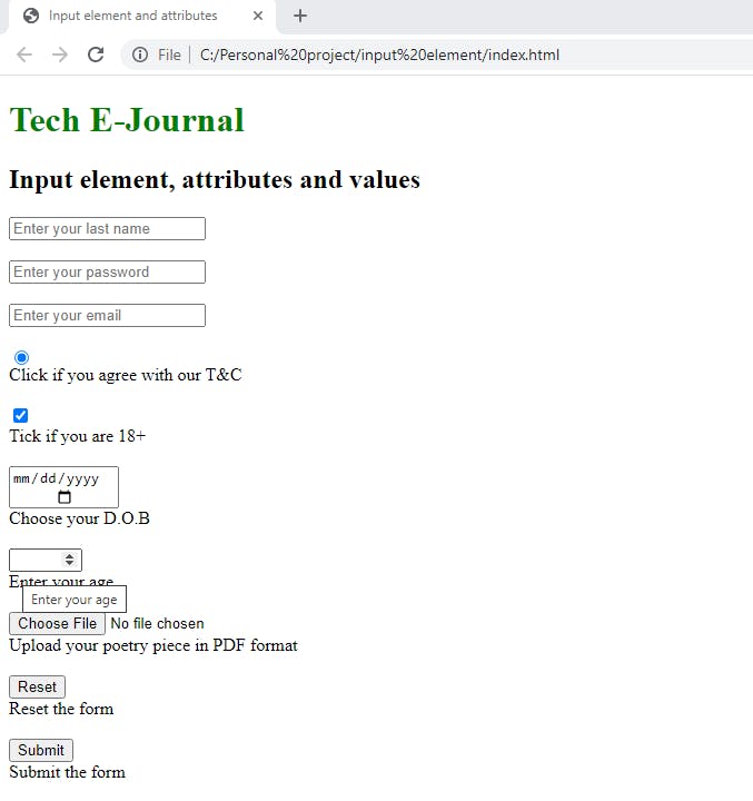
<h1 id="tej">Tech E-Journal</h1>
<h2>Input element, attributes and values</h2>
<!--Different <input> attributes and value represented below-->
<input
type="text"
name="lastname"
placeholder="Enter your last name"
required
/>
<br />
<input
type="password"
name="userpassword"
placeholder="Enter your password"
required
/>
<br />
<input
type="email"
name="useremail"
placeholder="Enter your email"
required
/>
<br />
<input type="radio" />Click if you agree with our T&C<br />
<br />
<input type="checkbox" />Tick if you are 18+ <br />
<br />
<input type="date" />Choose your D.O.B <br />
<br />
<input type="number" title="Enter your age" min="18" max="50" />Enter your age <br />
<br />
<input type="file" />Upload your poetry piece in PDF format <br />
<br />
<input type="reset" />Reset the form <br />
<br />
<input type="submit" />Submit the form
<br />
</body>
</html>
/*CSS styling for h1*/
#tej {
  color: green;
}
Code Output:
Recap
Now, let us do a brief recap of what we have learned so far;
The
<input>element is a self-closing element used within a form element to accept users' data in an information field.We also learned that the
<input>element can have its function customized using specialattributesand theirvalues.Some of these attributes include, but are not limited to;
type,name,required,min,max,placeholder,disabled,title,readonly, etc...We also learned that the most important of all the several attributes is the
typeattribute. This attribute gives the<input>element its identity.Some examples of
typeattribute's corresponding values include text, password, email, date, submit, radio, checkbox, file, etc...Finally, we looked at a typical code syntax of the
<input>element and some of its attributes and values.
Conclusion
Hello, again Developer! Glad you made it to the end :). I'm sure you have learned a thing or two from this read. However, if you have further questions or additions, please comment below or reach out to me on Twitter @eseose_ani.