A beginner's step-by-step guide to building a navigation bar using HTML and CSS
In this beginner-friendly article, you'll learn how to build a navigation bar(with icons) using only HTML and CSS. Dive in!


Table of contents
- Introduction
- Prerequisites
- Navigation bar template to recreate
- Register a font awesome library account
- Create a new folder, and files (Generate boilerplate code)
- HTML for layout, CSS for styling
- Recap
- 3 types of navigation bars
- Navigation bar best practices
- 3 reasons why a website needs navigation bars?
- Final thoughts
- Extra resources to further your read
Introduction
A navigation bar (also known as a navbar) is a section of a web page that allows users to explore and gain quick access to the information a website has to offer. The navigation bar as a general rule is situated at the top section of a website. It could either be built as a horizontal, vertical, or dropdown menu navbar.
In this article, I'll walk you through a detailed step-by-step process to build a responsive horizontal navigation bar using HTML and CSS. You'll also discover and learn how to navigate a programming library (specifically font awesome for icons). You'll also learn additional navigation bar knowledge that'll prove helpful as you go along.
Prerequisites
A basic understanding of HTML and CSS
An idea of what a library is(as related to software development)
A code editor to mirror code syntax (preferably Visual studio code)
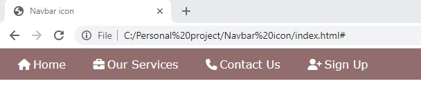
Navigation bar template to recreate
The image below is what we're to build. It would be the final look of our navigation bar at the end of this article. Take note of its intricacies, and break them into smaller bits, as this will help you visualize your code better and make you feel less overwhelmed.

Register a font awesome library account
Let's do a quick rundown of what "libraries" are. Libraries refer to tools that nest collections of files, programs, functions, etc. Libraries improve the work efficiency of the average developer by cutting down on repetitive and long-strain tasks.
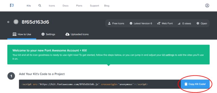
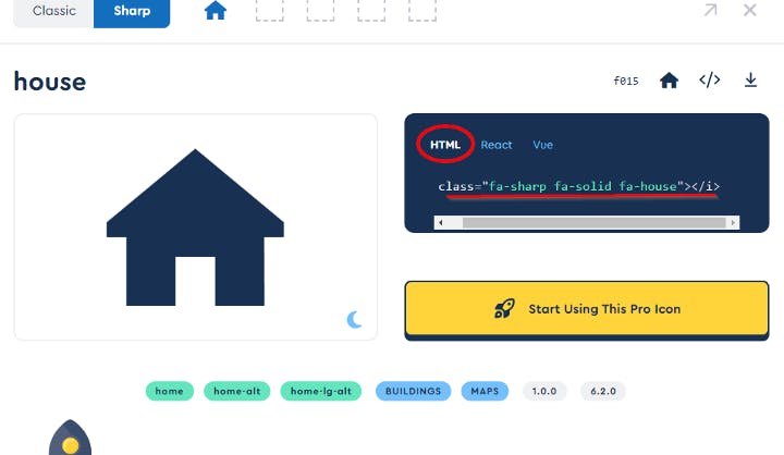
Today our focus is heavily latched onto a library specifically meant for housing various icons. In the above image, you notice that there are icons attached to each navigation bar element. With a few steps, we can gain access to a library with thousands of icons available for use. Follow the steps below to register and get started on font awesome.
(1) Open your browser and search for font awesome
(2) Follow the prompts to sign up and create an account
(3) Click on the "verify email" link to be redirected back to the website
(4) Click on the "Copy kit's code" button at the bottom-right corner of the web page.
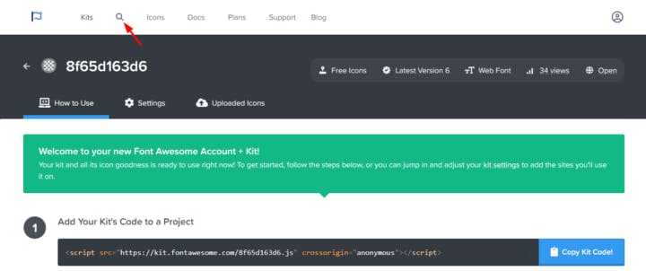
(5) Next, click on the search icon at the top-left of the web page
(6) Search for suitable icons that are a perfect match for each navigation bar element
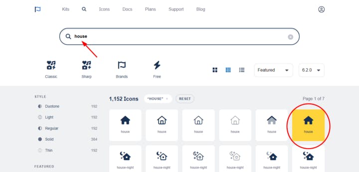
(7) Copy the HTML code syntax of each icon
(8) Paste it into each navigation bar's respective <a> tag and save.
Create a new folder, and files (Generate boilerplate code)
For every HTML web page, generating a boilerplate code is key. First, we must create a folder, an HTML file, and a CSS file for our navigation bar. Now, that we've successfully created an account with font awesome and also discovered how to search, and use icons. It's now time to set up our navigation bar's folder and files. Here are 5 steps to follow:
Create a new folder and let's call it the
Navbar iconCreate two new files inside the Navbar icon folder:
index.htmlandstyles.cssPress the keyboard shortcut
Shift + 1 + Enterin the newly created index.html file, to generate the boilerplate code you'd need for a basic HTML page. PS: This shortcut is available with a Visual Studio Code editor, that has an HTML5 extension installed. If you use a different code editor that doesn't permit this shortcut, create a basic structure of an HTML page.Add appropriate text in the
<title>element, for example,Navbar iconLink CSS and HTML using
<link rel="stylesheet" href="styles.css">Paste font awesome's kit code inside the
<head>element.
<!DOCTYPE html>
<html lang="en">
  <head>
    <meta charset="UTF-8" />
    <meta http-equiv="X-UA-Compatible" content="IE=edge" />
    <meta name="viewport" content="width=device-width, initial-scale=1.0" />
    <title>Navbar icon</title>
    <link rel="stylesheet" href="styles.css" />
    <script
      src="https://kit.fontawesome.com/8f65d163d6.js"
      crossorigin="anonymous"
    ></script>
  </head>
  <body></body>
</html>
HTML for layout, CSS for styling
We've set up our HTML and CSS files, we have our icons at a go. It's now time for us to build the layout (aka content) of our navigation bar. Follow these eight(8) steps below:
Step 1
Input the <header> element inside the <body> element. The <header> element is a semantic HTML element. Therefore, it not only gives structure but also defines the text it wraps. This means that it interprets the web page navigation bar as a header to search engine crawlers. This interpretation helps to improve search engine ranking on the results page.
Code syntax:
<body>
 <header>
  <nav class="navbar"></nav>
  </header>
</body>
Step 2
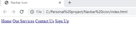
Add four(4) <a> tags (aka anchor tags) wrapped around navigation bar elements. Every nav element must be distinct and written in this format:
<a href="#">Our Services</a>
Code syntax:
<body>
    <header>
      <nav class="navbar">
        <a class="active" href="#">Home</a>
        <a href="#">Our Services</a>
        <a href="#">Contact Us</a>
        <a href="#">Sign Up</a>
      </nav>
    </header>
  </body>
Code syntax result:
Step 3
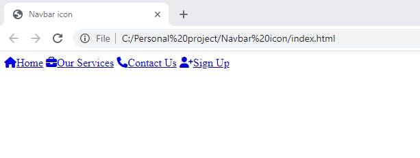
Earlier, we noted how and where we can find an icon. So, when we use the search icon to search for the "Home" icon. We copy its HTML syntax and paste it in the <a> tag wrapping the text "Home" For example:
<a class="active" href="#">
<i class="fa-sharp fa-solid fa-house"></i>Home</a>
We repeat this step for the remaining navigation bar elements, i.e. Our Services, Contact Us, and Sign Up.
Code syntax:
<body>
    <header>
      <nav class="navbar">
        <a class="active" href="#"
          ><i class="fa-sharp fa-solid fa-house"></i>Home</a>
        <a href="#"><i class="fa-solid fa-briefcase"></i>Our Services</a>
        <a href="#"><i class="fa-sharp fa-solid fa-phone"></i>Contact Us</a>
        <a href="#"><i class="fa-solid fa-user-plus"></i>Sign Up</a>
      </nav>
    </header>
  </body>
<!--The "active" value denotes the viewer's current page-->
Code result syntax:
Now on to CSS styling:
Step 4
In the CSS part, start off by styling the universal selector, which is usually represented by an asterisk (*) symbol. Set the padding, margin, and border to 0. Set box-sizing as border-box. We style the universal selector to ensure that our navigation bar HTML elements only inherit the specific style we assign it.
Code syntax:
/*universal selector styling*/
* {
  padding: 0;
  margin: 0;
  border: 0;
  box-sizing: border-box;
}
Step 5
In this step, we'll set the selector as header > nav and style with the appropriate CSS properties such as display, flex-direction, justify-content, row-gap, background-color, etc. The goal is to create a horizontal navigation bar similar to the one above. We achieve this using CSS flexbox properties.
Code syntax:
/*navbar styling*/
header > nav {
  background-color: rgb(145, 109, 109);
  display: flex;
  flex-direction: row;
  justify-content: flex-start;
  row-gap: 15px;
  text-indent: 5px;
  overflow: auto;
}
Code syntax result:
Step 6
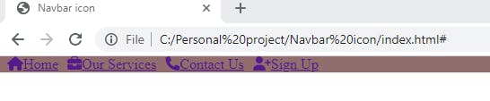
Now, we'll style the icons with a padding-inline of 4px. Setting the padding-inline as 4px creates a little space between each icon and its corresponding nav element. We'll also style the navigation links themselves. You'll agree with me, that blue is not a good look for this. Hehe :). Set the navbar selector as .navbar > a and input properties like:
text-decorationtonone, this removes the line underneath the linkscoloraswhiteto replace blueSet
font-sizeto18pxChange
font-familyto VerdanaSet an appropriate
paddingof13px
Code syntax:
/*icon styling*/
.fa-house,
.fa-briefcase,
.fa-phone,
.fa-user-plus {
  padding-inline: 4px;
}
/*navbar link styling*/
.navbar > a {
  text-decoration: none;
  color: white;
  font-size: 18px;
  font-family: Verdana, Geneva, Tahoma, sans-serif;
  padding: 13px;
}
Code syntax result:
Step 7
If you take another look at the navigation bar we are to recreate, you'll notice the Home icon and navbar element is in an active state, and so are highlighted by a dark red color. To replicate that, we'll set the CSS selector as .active and give it a background-color property of rgb(99, 1, 1). We'll also give our cursor a hover effect with the same background-color property as .active. That way, a navbar element is highlighted when a cursor hovers over it.
Code syntax:
/*hover styling*/
.navbar > a:hover {
  background-color: rgb(99, 1, 1);
}
/*current active page styling*/
.active {
  background-color: rgb(99, 1, 1);
}
Code syntax result:

Step 8
To make our navigation bar responsive on smaller screens like our mobile devices, we'll introduce media queries with a max-width p and a display property. A max-width set as 500px will automatically display our horizontal navigation bar as a vertical one on smaller screens.
Code syntax:
@media screen and (max-width: 500px) {
  .navbar a {
    display: block;
  }
}
Recap
In this article, we went through several steps in building a navigation bar, here's a brief recap of what we learned:
We did a memory refresher on what is meant by libraries (as regards software development)
We created an account on font awesome (a programming library for icons)
We imported and linked font awesome's kit code in the boilerplate code we generated
We set up a folder and its two files(
index.htmlandstyles.css) and linked them using the code syntax<link rel="stylesheet" href="styles.css">We built the layout of our navigation bar in sync with the navigation bar template we were to recreate using HTML
We styled the layout with appropriate CSS properties to make it similar to our reference navigation bar
We rounded off by making our navigation bar media responsive using media queries.
3 types of navigation bars
There are several types of navigation bars, now that you know how to build one, you should get familiar with the varying options available to you. Let's highlight three(3) of them below:
Sticky navigation bar: As the name implies, the sticky navigation bar sticks out at every part of the website. This means that no matter how far gone a user scrolls to the end of the website, the navigation bar is always in sight to help them navigate to any area they would like.
Horizontal navigation bar: This is the same as the navigation bar we built earlier and it's the most common type. It presents itself in a row-list format and features sections like, "About", "Home", "Services", "Products" etc.
Dropdown navigation bar: This type of navigation bar appears as a dropdown menu. When the user hovers their cursor over the dropdown menu, it displays options they can pick from. This particular navigation bar helps to conserve website space.
Navigation bar best practices
Now that we've learned how to build a navigation bar from scratch and also know a few types available to us. Let me share some of the major best practices you should keep in mind as you build more. Some of the best practices below were evident in the one we built.
Be specific: You certainly don't want your users confused on the first page of your website. That's why you should use easy-to-read-and-understand familiar words. For example, you'd communicate easier and better if you use "Home" rather than "Page Overview" as your first-page nav element.
Add icons to draw attention: 'Visuals tell a thousand stories words cannot tell'. Adding icons to your navigation bar will not only draw attention to that part of your website but also further clarify the nav elements. For example, A telephone icon by the side of the words "Contact Us" tells the user all they need to know about that nav element.
The rule of KISS (Keep it short and simple): In a bid to come off as interesting, try not to overcomplicate words. Leave them as they are. For example, a simple email icon on your website tells me all I need to know (that I can reach out to you via email). When you attach text such as "Send us an email at" to that email icon, your navigation bar becomes unnecessarily wordy.
3 reasons why a website needs navigation bars?
Have you ever visited a new country and had no friends, family, or tour guide to show you around? Frustrating right? :( That's exactly how it feels navigating your way around a new website WITHOUT a navigation bar in sight. Let's look over three(3) reasons why a website needs navigation bars:
Ease of direction: a well-structured navigation bar provides users with ease. A happy user will joyfully share their experiences with others, this will in turn reel in more site visitors and leads.
Gives structure to a website: an organized website is not only visually appealing to users but also gives structure to a website. Every section takes shape and coordinates accordingly. This allows for easy navigation.
Increases site visitor's duration: A well-laid-out navigation bar allows for swift and easy navigation. This means that users are less likely to bounce off and more likely to stick around because they're able to find what they're looking for without a hassle.
Final thoughts
I hope this article gave you the needed resources to help you get started on your first navigation bar. Remember, you feel safer when you have a map of where you're headed and that's what a navigation bar is to a site visitor; a website's map. Give your visitor a clear map today!
Thank you for making it to the end of this article. I write easy-to-understand articles for beginners and as always, your input is highly appreciated. If you need further clarification or have questions, please drop a comment or reach out to me via Twitter @eseose_ani.
Extra resources to further your read
Check out w3schools for more navigation bar knowledge
If you'd like to read more on libraries in programming check out careerfoundry
Check out font awesome to sign up and get access to thousands of icons.